
1: A blank canvas
This can be a really frightening sight first thing in the morning, when you have to rake some inspiration up from somewhere.
I would not like anyone to get the wrong idea here...I named the link to this page "Workshop" simply because I could not think of another. In no way am I implying that what I do and the way I do it is worth learning...I was requested to put a page such as this together, and it did not seem like such a bad idea - as ideas go. The following thoughts reflect only the way I paint...I am most certainly not saying that the serious art student must do it this way, or even that this is the best way. In fact, there are very probably a hundred better ways of doing it... This is mine
This can be a really frightening sight first thing in the morning, when you have to rake some inspiration up from somewhere.
My palette and brushes
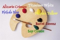 PALETTE
From the colours on this palette I can make just about any hue I need. It means that I can make subtle changes without losing the overall effect. I certainly find it less confusing to mix colours this way.
BRUSHES
This is an important issue. It was for me, anyway. I had to know what the other guys were using because, if I knew that, and used the same, my work would be as good as theirs!

It does not require a genius to realise the flaw in this line of thinking. But, I was not thinking. Not too deeply, anyway. What did it for me, in the end, was poverty, pure and simple. I did not have the cash to spend (in some cases) over ten pounds on a single brush, no matter how "purist" I wanted to be. Then, by chance, I saw the set shown here. Back in those days the set sold at just over three pounds. Today the same set is only about a pound dearer The thing is, I became used to the feel of them; the way the hairs "gave" under the pressure of your hand. It was only later, when I could afford to do so - and did! - buy an expensive brush, that I realised I was locked into those cheap brushes, and nothing else would - and still doesn't - do. I do, however, know artists who, for different reasons, locked themselves in the expensive kind of brush. I can only commiserate with them!
It boils down to what you get used to, I suppose.
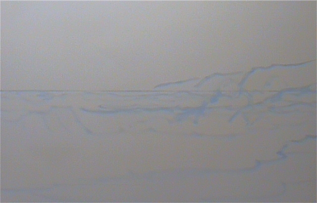
This is the first sketch. Rarely, however, does the finished picture exactly adhere to the sketch, except when I have been requested to make it do so. This is also the period when I make my mind up on the colours. This, for my money, is the most important part.
As I said up front, it's also important to me that I use as few colours as possible - if I could get away with using a single colour, I would do so - though that's probably stretching the bounds of reason a bit. This has not always been the case. Years ago I remember loading the PALETTE (hit the 'My palette and brushes button')with just about every hue I had at my fingertips, ending up with a confusing mess.
As I've said elsewhere on this site: you live and you learn!..
You probably can't see it, but the sun/moon is a paper stick-on from some stationary shop. I have a wad of them, all the same size, all the same colour - red. I stick one where I estimate the sun/moon should be. How I began doing that, I cannot remember, but I seem to have been doing it all my painting life. It works for me!
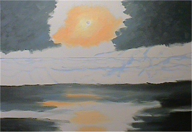
I begin by applying the lightest colour over and around the red paper thingy, working outwards and getting darker. Then I determine the darkest colour and apply that to the edges of the canvas, working inwards, getting lighter, but not actually impinging upon the sun/moon colour already there.
I then choose a colour somewhere in between these two areas and begin scumbling (if that's the correct spelling for it!). This is a happy period with no real worries attached to it...Scumble, Scumble, Scumble....Merging, eventually, the two areas into one. Then I brew a mug of coffee and stand back, eyeing the canvas through half-closed eyelids. This seems to give me a better idea of how it will all pull together.
Scumbling: Wiggling the brush about in loose Xs.
There may not seem a whole lot of difference between the picture above and this one...but there is - about 10 minutes more scumbling! I'm actually quite partial to the brush strokes being left on the canvas, and I do try that from time to time. Brush strokes are as good as a signature - or, they should be. Among other things, visible brush strokes say: "this is a painting, not a photograph!" I like to see them. When I look at other artists' work I study the brush strokes. I do not think I can explain everything the strokes say to me, but - to me - they are important. That said, I spend a lot of time eliminating them from my seascapes because - apparently - that is what people like to see (or not see) on canvasses with my signature on them. There is precious little justice abroad in the world!
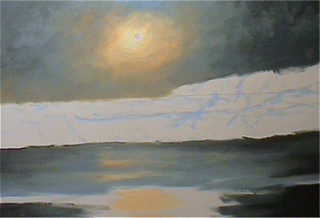
When I reckon I've scumbled enough I change BRUSHES. For this next step I use an ordinary house-painting brush: an one-and-a-half incher from a do-it-yourself store. More scumbling...but this time it's fairy-fingered stuff; mostly so lightly it's barely touching the canvas. This smoothes the whole thing down to where I like it. And I'm still talking sky here, so far I have not touched the sea area.
Witness the lack of visible brush strokes in the sky! Very sad, very bad! But it is the way things are.
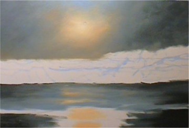
When I'm satisfied with the fairy-fingered stuff I gently remove the red paper thingy, exposing a clean sun/moon, which I later fill with the lightest colour on my palette. Incidentally, I make certain that the sky is scumbled lower than my horizon. This makes it possible to scratch - literally - the distant horizon into the wet paint. I used this scratched line to loosely indicate the meeting of sky and sea, then I scumble the line into near-oblivion. It is my opinion that if you make your most distant area, whatever it happens to be, a clear, crisp line, then you bring it forward on the canvas, not send it back where it belongs. And - yes! - I have seen such clearly delineated horizons at various times and under various weather conditions...but I do not think they are as attractive as indistinct ones - certainly not on a painting you could be looking at for some time.
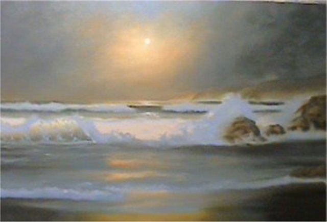
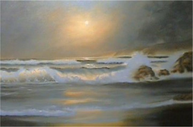
This is the middle-distance area. In many cases - certainly in Cornwall - the shape of the cliffs pinpoints the location. Some people ask for this, others do not. The problem is, if you start getting finicky with the middle distance you stand in danger of bringing it closer that it should be - of ruining the "depth" of your scene. Middle-distance cliffs can show a distinctive formation, if this is what you want, but they should not be desperately clear. I always Scumble the headland slightly; remind it who's boss!
As a rule of thumb, the shadowed water is the blue of the sky. Actually it is not quite as simple as that - experiment until you find the most pleasing effect according to you own tastes. Of course, the "rule of thumb" is blown away if there is no blue sky!One thing worth remembering is that "Payne's Grey" covers a multitude of sins. It is a lovely colour with many uses. If you have not shown blue sky in your scene, try adding a hint of Payne's Grey to a mid-range colour....INSTANT SHADOW!
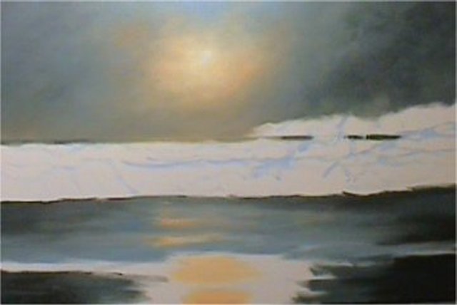
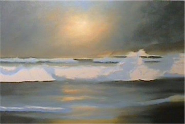
Nasty, this! I sit for ages...fiddling about with no clear direction. Scumbling here...fiddling there...and generally making matters worse than they actually are. Incidentally, the swell, before the wave breaks, is merely light scumbled to dark. Here, for the dark colour, I add a touch of sap green to the darkest blue of the sky . Seems to work.
Take a break
The foam comes next...If your waves are big-ish there will be foam (scud), and some of it will be rising with the as-yet unbroken swell.I should actually paint the shadowed scud darker than I do, since the light source is invariably on the far side of the slope. I have tried this, but prefer to keep reality at bay for a while.
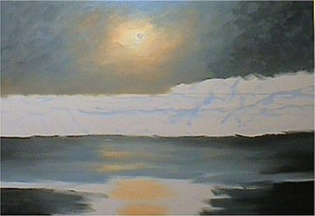
I am fast running out of things to say about these remaining shots. They were taken at something like fifteen minute intervals, and not at the end or the beginning of a particular stage. This, because I am not aware of "stages". Also, of course, this is the first time I have added such realities to the production of a canvas. Basically, I paint what I paint, the way I paint it, and in the time it takes me to do so. If it is of any interest, I do paint wet-on-wet. If something happens to delay me, and I have to return to a dry canvas, I find it very hard work indeed. I have a lot of time for the acrylic artist, who works wet-on-dry almost all the time. I admire watercolour artists for similar reasons. Oil paint is very forgiving!
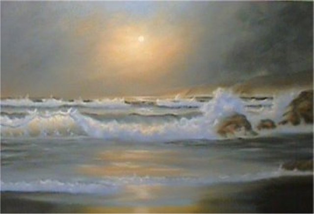
It's time to admit that this is not one of my best works. I knew that when I took the picture opposite. Mind you, the colours you see on this page - as seems so often the case these days, do not accurately represent the colours I see on the canvas. But I have discussed that problem elsewhere on the site. Nevertheless, this is definitely not the best I can achieve. I will do this again, and the results will appear here - for what they will be worth. I am not saying that this is a bad painting; merely that I am aware that it is not my best. It'll do for now.
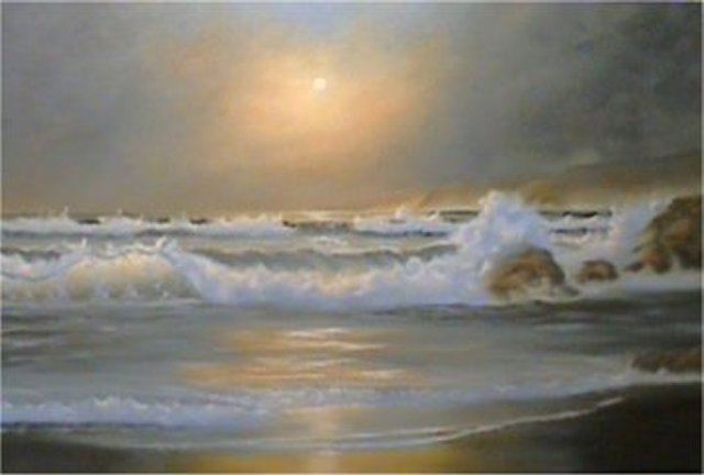
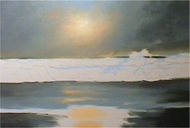
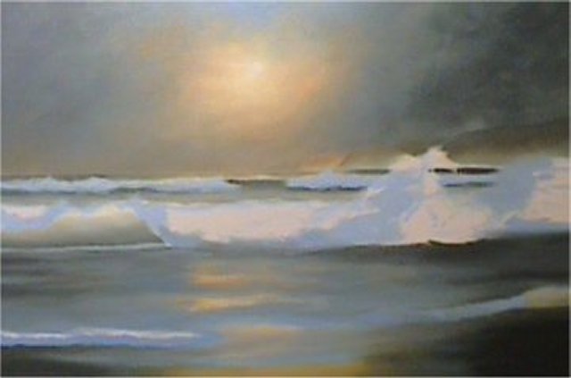
I cannot for the life of me see fifteen minutes-worth of result between the picture opposite and the "finished" one below...But a fifteen minute period of work there most definitely was!I suppose I just fiddled with highlights.
Highlights
No mystery. These are the colour I filled the circle with...the light source.
(Reading that sentence back, it seems I need grammar/syntax lessons).
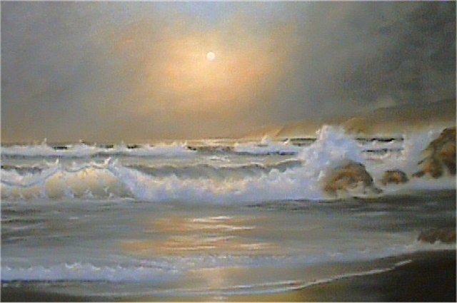
And this is it! The finished article...For good or ill, this canvas was sold before this page was finished and uploaded. It's a strange and a wonderful world at times.
What can I tell you? I really hope someone got something out of this little exercise...(Remember what McArthur said when he left the Philippines)